Packaging design is where material science meets visual psychology. The combination of wood finish and glass bottle color creates an immediate impression that either elevates or undermines brand positioning. This guide provides practical frameworks for achieving harmonious wood-glass pairings across fragrance product categories.
1. Understanding Wood Color Temperature
Wood finishes can be categorized by their underlying color temperature:
- Warm woods: Walnut (chocolate brown), cherry (reddish-brown), teak (golden-brown)
- Cool woods: Maple (pale cream), ash (grayish-white), birch (white-pink)
- Neutral woods: Oak (medium tan), beech (light amber)
Matching principle: warm woods pair with warm glass colors; cool woods with cool glass colors. Neutral woods offer the most flexibility.
2. Perfume Bottle Pairings
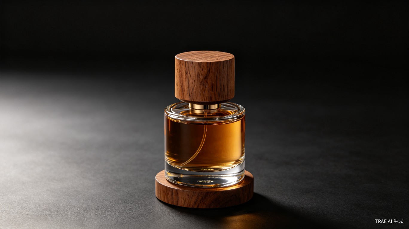
Clear glass + dark walnut: The classic 'transparent elegance' combination. The clear glass showcases the perfume's color while the dark wood cap provides grounding visual weight. Best for: unisex and masculine fragrances.
Amber glass + natural oak: Warm-on-warm harmony. Amber's golden tones echo oak's honey coloration. Best for: oriental and gourmand fragrances.
Frosted white glass + bleached maple: Minimalist Scandinavian aesthetic. The pale palette creates a sense of purity and modernity. Best for: clean, aquatic, and minimalist brands.
Black glass + ebony: Maximum drama and luxury. The monochromatic dark palette conveys exclusivity and mystery. Best for: ultra-luxury and evening fragrances.
3. Reed Diffuser Pairings
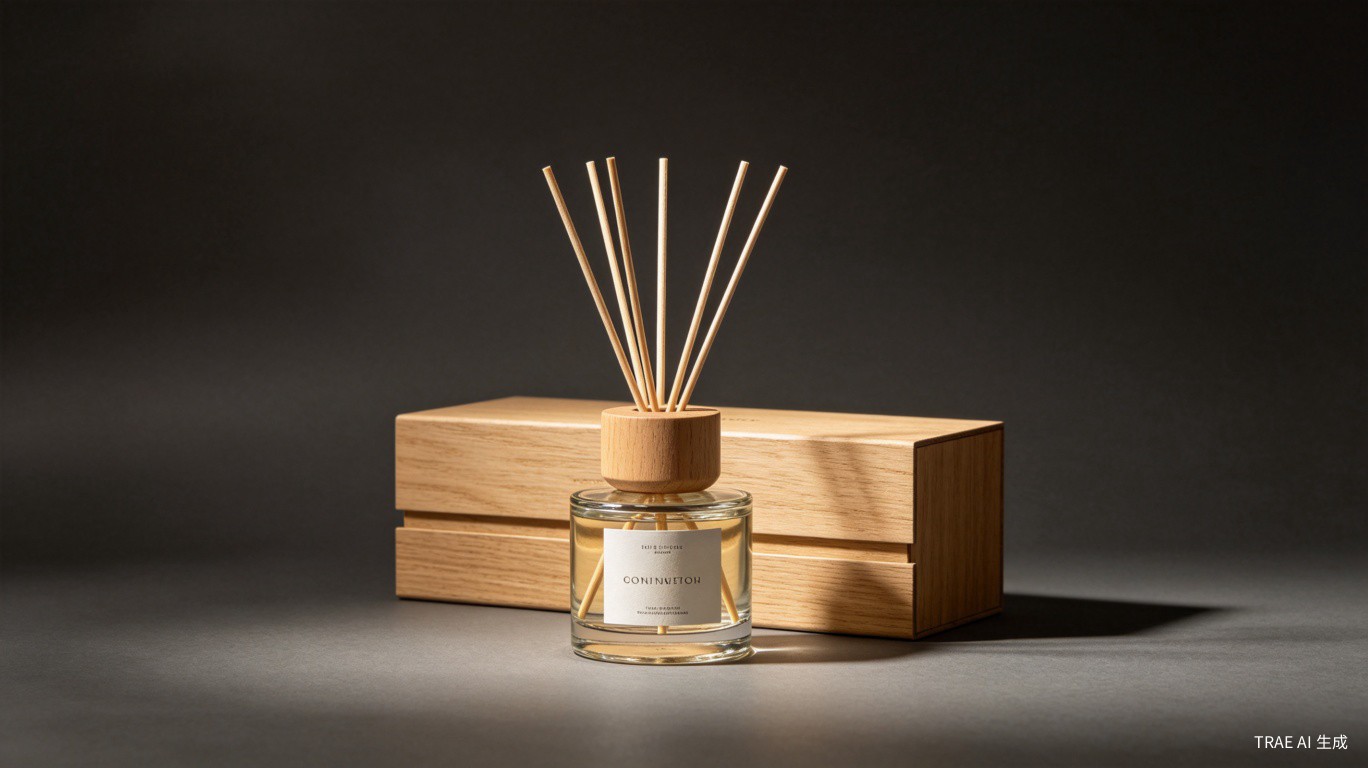
Diffuser bottles typically use transparent or lightly tinted glass to showcase the liquid. Wood stopper color becomes the primary design element:
- Transparent liquid + bamboo stopper: Natural, spa-like aesthetic
- Pink liquid + light beech: Soft, feminine appeal
- Dark liquid + black-stained wood: Sophisticated, masculine
4. Candle Jar Pairings
Candle packaging must consider both the unlit and burning states:
- White wax + raw beech lid: Clean, bright, Scandinavian
- Colored wax + matching wood stain: Coordinated, brand-consistent
- Black wax + walnut lid: Dramatic, moody, luxury
5. Finish Texture Considerations
Beyond color, surface texture significantly impacts perceived quality:
| Finish Type | Visual Effect | Best Paired With |
|---|---|---|
| Matte oil | Natural, organic | Frosted or textured glass |
| High-gloss lacquer | Luxury, refined | Clear or colored smooth glass |
| Open grain | Rustic, artisanal | Amber or olive-tinted glass |
6. Practical Design Workflow
For brands developing new packaging lines, we recommend this sequence:
- Define brand personality (luxury, natural, modern, traditional)
- Select glass bottle color and texture
- Choose wood species based on color temperature match
- Specify surface finish to complement glass texture
- Produce 3-5 physical samples for team review
- Test under different lighting conditions (retail, natural, photography)
Conclusion
Successful wood-glass pairing requires understanding both materials' visual properties and the emotional response they evoke. TUOCHEN offers wood finish sample libraries with 30+ standard options, and custom color matching services for brands with specific Pantone requirements.